We are developing the social individualist meta-context for the future. From the very serious to the extremely frivolous... lets see what is on the mind of the Samizdata people.
Samizdata, derived from Samizdat /n. - a system of clandestine publication of banned literature in the USSR [Russ.,= self-publishing house]
|
A visual illustration of how much money printing has been going on

As a supplement to Johnathan’s post. A couple of points:
- This is M2 which is cash and bank deposits. There are other measures like M3 and M4 which measure other forms of money. I would have preferred to have used M4 because – if I recall correctly – it is the broadest measure, but I couldn’t find a graph for that.
- The black line is money supply growth; the red line is inflation (CPI).
- The percentage increase in 2020 was greater than at any time since before the Second World War. Even in the middle of a world war there was less money printing.
Update 10/5/22. As Douglas2 points out this is a graph for the US. Ugh. Luckily TomJ has found a graph for the UK which looks like this:
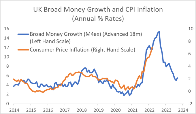
This is very similar so long as you are aware that the blue line has been moved 18 months to the right. It also suggests that this bout of inflation is likely to be short-lived.
|
Who Are We? The Samizdata people are a bunch of sinister and heavily armed globalist illuminati who seek to infect the entire world with the values of personal liberty and several property. Amongst our many crimes is a sense of humour and the intermittent use of British spelling.
We are also a varied group made up of social individualists, classical liberals, whigs, libertarians, extropians, futurists, ‘Porcupines’, Karl Popper fetishists, recovering neo-conservatives, crazed Ayn Rand worshipers, over-caffeinated Virginia Postrel devotees, witty Frédéric Bastiat wannabes, cypherpunks, minarchists, kritarchists and wild-eyed anarcho-capitalists from Britain, North America, Australia and Europe.
|
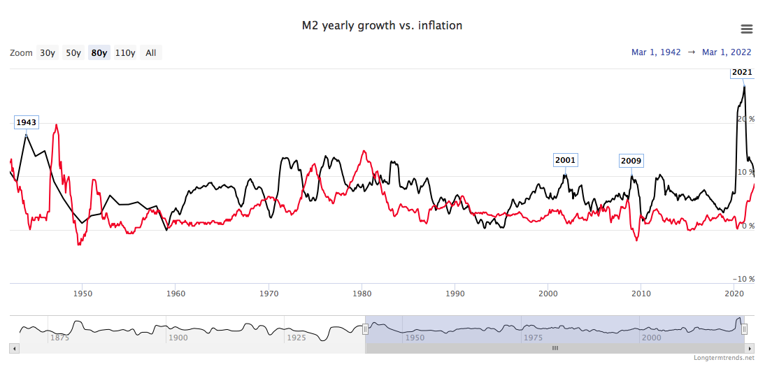


I had to click through to determine that this is data for the USA.
Most of the larger episodes of money printing were followed by inflation spikes. I’m guessing a macroecon major would understand this–I do sort of. But there is a glaring exception: the printing orgy in 2009-2011 (I guess they had to back off in 2010 to let the presses cool down?). No commensurate burst of inflation. Why?
Also, I don’t much trust government statistics, but can anyone tell me if inflation has been largely calculated (measured!) the same way throughout the period shown? We probably have a better answer to this in recent decades vs 80 yrs ago, but any insights would be appreciated.
Just eyeballing the graph, looks like inflation has averaged about 5% over the time shown.
Thatis about the same as Australia’s rate over the last 50 years.
For the UK, over a shorter period: https://twitter.com/julianHjessop/status/1522230953434832897
M4 is a better measure than M2 but the definitions of Broad Money were from the pre internet era (for the most part) – I can see inflation being persistent and highly pervasive. It should top 30% at the absolute minimum next year, with high probability of famine in parts of Africa, severe economic disruption, widespread social discontent and significant collapses in most stock markets. I sincerely hope I am wrong but the progress of The Great Reset continues apace (with willing collusion from Supranational organizations and the mainstream media)The destruction of living standards is a key component of it.
May I ask if the US inflation numbers reflect changes in definition or just the published US data?
Well that’s all well and good but as anyone who knows about inflation rate knows, the official stats massively under report true inflation in the first place. So going back to ‘low’ inflation of 2-3% (ha!) after a period of 7-12% (or more) inflation is NOT a win and doesn’t deal with any underlying issues. Other than hiding the fact that inflation is a killer because it’s ‘only’ 2% or whatever the carefully managed fiure really is.
But ok, massive inflation will only last a year or 2, cool. I still will have lost 7-12% of my purchasing power in one year, and with compounding ahead (2%+2.5%+2%+10%+2%) still leaves us all floundering.
As an aside I was reading an article about how we still live under Blairism after 25 years and how his changes were never rolled back. The point was made about having the BoE as separate from politics (not that it is in real terms I suppose) and it made a very interesting point.
Surely the economic policy of the country should also be decided on by voters/political parties and not remain outside of the control of democratically elected representatives? Thought that was an excellent point that merited more thought.
@GregWA
CPI measurement is most certainly not consistent. Things that are used to measure CPI change ALL the time (see here for an e.g. https://www.bloomberg.com/news/articles/2022-03-14/men-s-suits-are-no-longer-suitable-for-measuring-u-k-inflation
https://www.nationalworld.com/news/uk/how-is-inflation-calculated-ons-process-in-calculating-cost-of-living-through-consumer-price-index-explained-3575005
Also, and this is a key point, things in the basket are given different weightings all the time which affects the readings.
Interesting note-council tax is not included in UK CPI.
Here is an interesting website that calculates inflation in the US using older CPI models. Quite an eye opener http://www.shadowstats.com/alternate_data/inflation-charts
Also, and this is the REALLY interesting part, a product can go up in price and have little to no impact on inflation. This is because of how CPI works, and how it is gamed to be lower. I used to work in govt and find this chicanery easier to process after an experience I had there. I was in charge of collating data for departmental KPIs, one of which was efficiency/money saving. I spoke to one of the bright young things and questioned their figure which displayed they had cut costs by about 3%.
I asked specifically what they had cut spending on and the answer was “nothing, but we have worked out that we do x and y processes more efficiently than before and have worked out the ‘savings’ as a result and have given it this figure.”
So they had not reduced their spending but were claiming they were spending less. I think that was when I decided to leave. As an aside, it’s interesting to note that this sort of legal/contextual/nuanced chicanery is prevalent across the entire political system, from politicians to the supposed ‘good guys.’
Using that example, try to get your head around this. Despite the fact that PCs/laptop/tech cost more, they can actually reduce inflation rates on the RPI figure.
Let’s say the tech has advanced x amount (let’s say 100), and price has only increased by y amount (let’s say 98). Which means that you get all that extra tech for a cost of -2! Whether that extra tech is worth 100, and whether it is worth it, you will fully use it is of minor consequence. Nor is the fact that the price has increased. It hasn’t increased at all because of all the extra ‘value’, and as a result of statistical tweaking it has actually decreased in price.
As you can see, this technique can be applied to any inflation figure (CPI/RPI etc) in the same way it was done at the civil service.
CPI/RPI is gamed to the nth degree. If it gives a figure of 2% I would say that it is at least 2% higher on a long term historical basis. How do they measure shrinkflation? What weighting is it given? How do they measure fiscal drag when more people are dragged into higher tax brackets by the freezing of tax ceilings? The list goes on.
As a final note, I found it very interesting searching on google and bing as practically all the websites I was directed to were govt websites no matter what the search terms. Looks like a pretty effective scrubbing/redirection strategy to me.