We are developing the social individualist meta-context for the future. From the very serious to the extremely frivolous... lets see what is on the mind of the Samizdata people.
Samizdata, derived from Samizdat /n. - a system of clandestine publication of banned literature in the USSR [Russ.,= self-publishing house]
|
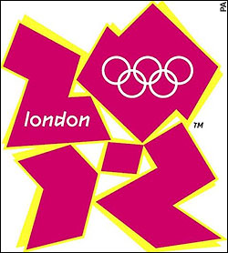
A superb logo is unveiled for the London Olympics The new logo for the 2012 London Olympics has been unveiled and it has produced howls of outrage. Yet I beg to differ. I think it is perfect.
What does it look like to you? To me it is obvious: a collapsing structure of some sort, perhaps a building at the moment of demolition. The sense of downwards motion towards the bottom of the page is palpable.
Breathtaking. I mean what truly magnificent symbolism. The entire Olympic endeavour has been a massive looting spree with already grotesque cost over-runs (and it is only 2007), so surely something that conjures up images of collapse and disaster is really on the money… and speaking of money, at £400,000 (just under $800,000 USD) for the logo, it perfectly sums up the whole ‘Olympic Experience’ for London taxpayers.
No, if ever there was ‘truth in advertising’, this is it. Well done Lord Coe, I salute you.
|
Who Are We? The Samizdata people are a bunch of sinister and heavily armed globalist illuminati who seek to infect the entire world with the values of personal liberty and several property. Amongst our many crimes is a sense of humour and the intermittent use of British spelling.
We are also a varied group made up of social individualists, classical liberals, whigs, libertarians, extropians, futurists, ‘Porcupines’, Karl Popper fetishists, recovering neo-conservatives, crazed Ayn Rand worshipers, over-caffeinated Virginia Postrel devotees, witty Frédéric Bastiat wannabes, cypherpunks, minarchists, kritarchists and wild-eyed anarcho-capitalists from Britain, North America, Australia and Europe.
|


Surely, this is a joke?
nope.
Speaking as a real-life, honest-to-gosh graphic designer this is AWFUL. And someone got severely overpaid.
My condolences to my friends across the pond.
Looks like surveillance footage of Hugh Grant and Divine Brown.
These are actually quite good. If you slipped the real one in there and asked someone to decide which was the real one, how many would choose the £400k one?
Wadded paper.
at £400,000 (just under $800,000 USD) for the logo
Surely they could have gotten something not nearly as bad for half the price?
See what happens when you mix origami and high explosives?
Certainly not me Ham!
My favorite is the one that spells out London using the traditional rings in an imaginative way.
Cor what a stinker!
I’m afraid the Games will be too!!
Sorry. Have to come back here.
I was just going to bed and idly staring at the goddam thing.
What it reminds me of is when we were poor and my wife used to make her own clothes.
It looks like bits of a cut out pattern for a dress or blouse or something.
It is supposed to spell out 2012. Well that’s fairly obvious in a weird trapezoid way.
But what is that little almost square bit doing in the middle? Makes no sense to me.
The lettering of London, note no capital in london, how droll!! and the rings, were obviously done by an infants class that won a Nationwide competition to do crap lettering.
Makes yer proud to be a Londoner Dunnit .
Eight hundred grand.
{guffaw}
Oh, that’s rich, I tell you. Perfect.
I always love a good bonfire, and that’s unforgettable.
{laff, laff, laff}
So this is what is meant by ‘Cool Britannia’? As in ‘room Temperature Britannia’? As in brain-dead? Maybe there’s still time to give the games to someone else?
It’s not surprising the one selected was expensive crap considering government had a hand in it. What’s the possibility that it violates some EU regulation?
I agree there were some really good ideas at the BBC page.
Fabulous. A collapsing house of cards. Perfection at a level the sponsors and creators could never have imagined.
Origami Zoor Something. Who did it? Huguito Chavez from Venezuela got the Copa America Mascot (Link)from a school pupils contest. $0.
Since someone pointed out that it looks like Lisa Simpson giving a blowjob, I’ve had difficulty seeing anything else when I look at the logo.
I see a man bent double with back pain.
Perfect for the world’s premier athletic event.
You’re all wrong!!! It looks like a car skidding out of control! The first person to come up with a ‘skid-mark of history’ joke could have a great career as a stand-up comic in America!
Damn it, Tim, now I have to go have my brain washed…
It is a supplicant presenting his ID card – central in the picture, of course – to an official, in order to be enabled by technology.
It’ll probably turn out that it violates some Euro regulation and some ‘socially responsible’ High court judge will rule it violates someone’s human rights, or some group will decide it demeans them in some way.
Then ‘they’ will have to change it for something even more crap at twice the price.
I could have turned out something far better and for far less – in fact your average class of 9 year olds could have for that matter.
Yes Tim (you must know some sick folk) it does indeed look like, as you say, Lisa Simpson playing the pink oboe. Matt Groening ought to sue.
This is going to make the dome look like a minor farce.
They’ve given up even pretending haven’t they?
Phil A, somewhere, some year eight students are crying about your comments on their work of art. Some might-have-been-Picasso has changed her/his career choice , and will become a bureaucrat who regulates art.
Are you proud of what you have done?
Check out http://theospark.blogspot.com/2007/06/london-olympics-logo.html
for a rather good parody.
I can’t look at that logo with out giggling. This is going to be the silliest olympic games ever.
The zero looks like a stylised representation of Australia, it even has the TM logo to represent Tasmania.
National Pride?
For 9.2 Billion we could have written ‘fuck off Germany’ on the moon.
To me, it looks like broken panes of glass and makes me want to smash windows.
I was going to say Mr Incredible (The Incredibles) straining to do up his belt.
But then I read the Lisa Simpson option and now I have the most terrible case of foreground/background inversion, or battling perspective or something like that. Very Escher.
Fragmentation presided over by a Socialist government. Not sure what the yellow is for though.
Still trying to recover from the Telegraph comment that it looked like Lisa Simpson giving her brother Bart a very special birthday present …
Anyways, amazing what one can do with Illustrator and too much time on one’s hands 🙂
Yesterday they were saying “the children” designed it, so it was bad form to say it was rubbish.
Actually it is bad to tell children that bad work is good work (false “self esteem” is dangerious vanity). One must be honest with children, only by being honest is one treating them with respect.
As for the “logo” itself. Yes it looks like a collapsing house of cards, or a pile of rubble. Perry is correct, it is a perfect symbol for the absurd London Olympics.
Of course a dishonest P.R. person (such as the vile Mr Cameron) would simply take the words “perfect symbol for the ….. London Olympics” from the above, and leave out the rest.
P.S. Why is the word “London” in the logo shown as “london”? It reminds me of the point made by C.S. Lewis (in the “Screwtape letters” that demonic entities do not like capital letters, because capital letters are inegalitarian).
No Nick, I was saying they (the 8 year olds) are already much better than the sort of pseud who takes a year and charges £400K – and you know, if they keep on, things can only get… better? 😉
My daughter designed it in pre-chool last week.
It reminds me of the red Rock-Em-Sock-Em Robots (Link)going down on one knee after getting gut-punched by the blue one.
“Yesterday they were saying “the children” designed it, …” [Paul Marks at June 5, 2007 01:54 PM]
Really? I hadn’t caught that. They must be thrilled at becoming wealthy so early in life and for merely drawing a logo. Did they say how much they got paid?
Could he be somehow related to Lord Coe ?
If not, then it really makes no sense.
Rumour is it was the same bunch who did the Labour Rose.
What makes me laugh is that they took pains to trademark it…as if someone is goiing to STEAL that!?
I find it impossible to to imagine that this thing took more than 400 seconds to create. Even the typeface for “london”, not even capitalised, is an utter disgrace. It has all the artistic and creative merit of one of those “jokey” office posters written in “MS Comic Sans” with one of the crushingly predictable pieces of “clap art”. Frankly, I am surprised that it did not include the “bending man with magnifying glass” image.
Lisa Simpson? . . . oh My EYES!!!
Turns out it was the same company that was behind the spectacular success of marketing the Millenium Dome.
No surprise there then.
Not Lisa Simpson, but the Duchess of Argyll and the Headless Man.
We will see how stubborn the people behind this can be.
Tims Liza Simpson ahem, observation, is at this moment leaking out on the comment pages of the MSM.
When enough people have seen it “That way” and I defy anyone to see it any other way, after Tim had so kindly pointed it out to us-
Well I think this logo may be toast by tuesday!
Nice one Tim !
Who broke a plate?
When I was in elementary school, they sometimes used to give us little geometric shapes to make tessellations with. This looks like the results of one of those sessions.
Seriously, this is just awful. Not only is it garish, the “2012” is only legible because you know what it’s supposed to be saying.
Rab, I beat your defiance! I STILL see it as an olympic bandwagon which is slipping out of control somewhere in londontown. I agree, though, that they need a new logo, and if they’ll give me heaps of money, I should be able to come up with something better.
Please tell me this was chosen at random from the submissions…please? The Olympic-ringed “London” is so superior, an idiot would have to be coerced into choosing this Dadaist vomit
If it will make you feel better, Jeffersonian, yes, it was picked blindly in the town of random. And there really is a Santa Claus!!! Would I lie to you? :}
http://img9.imagepile.net/img9/12224olympicgschpunken.gif
Here’s a thought – don’t I remember something about the govt criminalising child abuse image *drawings*, as part of the bill criminalising extreme violent images. If so then, given the number of people who claim to see the logo as a depiction of Lisa Simpson performing a sex act, can we expect charges to be brought?
Seriously – what the hell is that meant to be?
Seriously – what the hell is that meant to be?
OK, I admit that the Bart/Lisa thing is already a serious problem that can only get worse but. . . .
I like it. All the other logos I’ve seen for the Olympics compete to express that ineffably smug and phoney “mens sana in sana corpore” uplift of the “Olympic spirit” that jars so crashingly with the sordid and corrupt reality of the corporate hullaballoo which surrounds and usually overwhelms the actual athletics. Whatever else this logo may or may not do, it doesn’t do that, thank God. Instead, we’ve got an uncompromisingly loud and trashy daub which acknowlegdes and exposes the aggression at the heart of competitive sport. And is unapologetic about it.
Of course you don’t like it. But you know, maybe the Olympics has some other function than making people feel smug and cool and damned-near asleep in the front of the telly. In fact, I’d go so far as to say that if it makes you want to smash the telly, it’s probably worked. If you know what I mean. . .
Perleeez Bruce!!!
It’s bad enough standing still !!!
The Seb Coe Show is still tuffing it out on the print version, but the animated one is already in trouble.
Complaints from the public of Headaches and nausea possibility of triggering epeleptic fits.
Our well known comedy double act Elf and Safety
is on the case.
It may have to be re-edited.
I do not know whether “the children” got paid anything, or whether it was just a quetion of getting them to pick out this “logo” from a selection (in which case they may have picked the worst one, as a joke).
Yesterday the story was that the animated version of the logo was causing people to have seizures.
I assumed that this was a joke, but it turned that some epilectics (and some other people) had their health harmed by the animated version of the logo and the animated version will no longer be shown.
So “design matters!” but not quite in the way our “cool Britannia” masters would claim.
MRDA,
It represents Lisa Simpson performing horatio, playing the skin flute, giving a pugwash… Gawd damn it! I’ve already run out of euphemisms for oral sex.
I didn’t see that until Tim pointed it out. Now I see nothing else. I possibly never will. I always had a bit of a crush on Lisa Simpson and the show’s now been running so long she’ll be street-legal. Perhaps it’s time to “put away childish things” and dump Cheetara.
I never much fancied Jessica Rabbit. Everyone’s spilled some seed over that one. The slag!
My prediction is that the seizures will lead to a hasty return to the Olympic bid logo – cute excuse isn’t it? Given that they already had a logo, God alone knows what possessed them to spend 400 big ones on that.
Am I the only one who thinks it has a hint of a 50s/60s film poster? Were the designers seeking to emulate the style of the Festival of Britain?
Obviously with Lisa Simpson giving a recital upon the pink oboe in order to give it a contemporary edge and appeal to the yoof market.
Fuck me, I should be in advertising!
Believe me. You wouldn’t like it Nick.
I tried it for a year or so, oh a long time ago now,
and I’m still not sure I’ve managed to scrub my soul clean!
“Horatio”? Didn’t you mean “fellatio”?
I think it fits the current state of play for the London Olympics perfectly. Complete chaos and a total clusterfuck or an interpretation of vomit whatever it works.
Alisa,
I meant “horatio” – an utterly disgraceful sexual activity possibly leading up to performing “the dreaded rear-admiral”. Fellatio on the other hand was a character in Hamlet.
And the fact that there was a “character” in Hamlet is pretty disgusting but then the Tudors and Stuarts were a pretty salty lot.
It’s Horatio as in Horatio Hornblower.
I live and I learn!:-O
Nick and Alisa
You should form a double act!
Slightly off topic I had a rather dim girlfriend once
who thought that Cunnilingus discovered America.
I was always happy to put her straight on that point.
Obvious,it’s and exploding suicide logo.
My reaction exactly. The Ground Zero pile or its falling components. Breathtakingly, pompously perfect in its awfulness.
Cunnilingus didn’t discover America. It was either the Vikings or the Chinese depending on who you read.
Magellen though, did circumcise the world with a forty-foot cutter.
And you probably think it makes the world Jewish? I got news for you then.
Nick and Alisa
You should form a double act! Only if he promises to keep his knees exposed at all times!
Ah! So that’s what the M stands for!!
He’s a Mason!!!
Perhaps the logo should replace the Union flag.
After all it shows what the modern United Kingdom of Great Britain and Northern Ireland is really like. It is a good banner for both Mr Blair, Mr Brown (with his brother “in P.R.”) and, of course, Mr Cameron.
The logo-flag would be a good reminder to people to never visit or invest in this country.
Why, are masons known to be knee exhibitionists?
Well one knee certainly!
You’ll have to fend for yourself with the remaining trousered one 🙂
One more:
Olympics logo tweaked
ok, all i can see is lisa simpson giving a blow job!!! yeah great logo, yent!
lol as a web developer and had a lot of experience with this sort of thing, that is by far the most god-awful logo I have ever seen in my entire life.. And 800 grand? holy hell whoever got put in charge of that department needs fired, disgraced, and never allowed to work anywhere ever again mcdonalds might be too prestigious. Oh, and whoever designed it should suffer the same fate who charges 800k for a logo.. absurd looks like something for a physical education film straight out of the 1980s
Terrible! Probably a case of client demanding something ugly.