I last logged out leaving the Samizdata just as I like it. There was a place for everything and everything was in its place. Yes, it may have been a bit shambolic and démodé but it was comforting and familiar like an old friend or a favourite armchair.
Only look at what has happened! I turn my back for a few hours and some anally-retentive busybodies have gone and called in the Feng Shui consultants. Now my loveable, historical old Blog has been has been consigned to the scrap heap and replaced with this ultra-hi-tech, cutting-edge, state-of-the-art thingy which they are probably going to tell me has been conceived for ‘balance’ or ‘harmony’ or ‘enhanced Chi‘ or something.
And as if that act of wanton cultural vandalism was not enough they have also furnished me with a new-fangled set of coding instructions with ‘stylesheets’ and ‘javascript’ and ‘xhtml’ this and ‘attribute’ that. The whole thing reads like stereo-assembly instructions. How is this old dog supposed to learn all these new tricks? It took me look enough to programme me the first time round. They will doubtless have to ship me off to the manufacturer now to be re-chipped and re-booted.
Or maybe they are planning to give me a make-over. Yes, I bet they are. After all age and experience counts for nothing these days. It’s all about image, image, image and daresay I am no longer regarded as sufficiently ‘happening’ anymore. I can see myself now, being prodded and poked around by a squadron of invidious design-gurus (“Dahhling, that haircut is just sooooo 2003″).
I would write a letter of complaint to these soulless technocrats but what good would it do? Besides they have all probably swanned off to some fashionable Islington eatery where they are quaffing down the polenta with rocket salad and feeling very smug about being so ‘cool’ and a la mode.
Bah! It’s all humbug.


You grumpy old fart, you!
Hey, who ‘r ya callin’ a technocrat matey?
looks good to me –
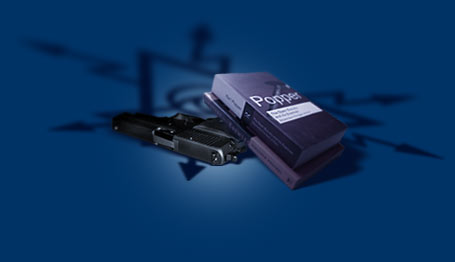
the same basic format with more style, user friendliness, and most importantly the gun.
the auto HTML for comments is nice – the only fault I can find is that the comment text field is 10 or 15 px smaller in width than the HTML menu below it. (Panther, Safari,1024 X 768)
LOL 🙂
Just toss a sabôt into the gears :).
Actually, on the design side, the only quibble I have is that the pistol between posts is a bit on the large side – I’d go with something smaller.
It’s an oft-repeated graphic and it’s something that should melt into the unconcious, lest it becomes annoying as would a big, block lettered “THIS IS THE END OF THE POST” repeated after every entry.
Forgive me DF 🙂 I otherwise bow to your sense of style in all other matters 🙂
-Vic
I like the look of the new site but I’m bored with the gun already.
Samizdata people in Islington? Never.
‘a la mode’ should be spelt ‘à la môde’.
Just type the ‘&’ followed by ‘agrave;’ and ‘ocirc;’ to get the desired French characters.
Besides, polenta and rocket is so passé…
:-p
The document is in iso-8859-1; you don’t need to type HTML attributes to get the French/German/Spanish accented charaters.
ßäöü
Now, I suppose if you want the Croatian Ć or the Czech Ř or the Russian и you’d need to type in numeric HTML attributes. 🙂
I sort of like the “Queer eye for the straight guy” makeover. I would change one setting so the page does not force in the banner/boxes on each side thus making the type in the center narrow as heck.
Keep up the good work.
David,
It’s “anal-retentive”, not “anally-retentive”. Unless you really meant that these busybodies can pick things up with their arses.
Squander Two,
Unless you really meant that these busybodies can pick things up with their arses.
You clearly do not know them as well as I do 🙂
Except for the 7 in wide blank strip down the middle, the screen width being 154% of my monitor, and the information column being only 3 in wide, it’s really spiffy.
N 7.1, Win2000P, 11 in wide monitor.
I would change one setting so the page does not force in the banner/boxes on each side thus making the type in the center narrow as heck. Keep up the good work.
Yes! Yesyesyes! Please guys, I beg! Narrow column+big font=unpleasent reading experience.
Looks nice. But what happened to the ‘Regime change begins at home’ logo / link to arrse.com? The British army’s home blog had some of the funniest and most incisive content on the whole web.
My tuppenceworth:
The lilac links on a purple background aren’t that easy to read. Ditto the orangey links.
I’m even having problems seeing the word “Quote” here in the editing box.
On the plus side, the new editing functions in the comments page are a welcome addition.
Have you considered whether the redesign makes the site less accessible to people who are visually impaired? You might be in breach of the Disability Discrimination Act – 😉
regards
Oh yes, I see what you all mean.
Well, I like guns but the only gun I can see is the one on the banner. Also, I don’t know why I seem to be the only one who can’t get rid of the black background. I cleared out my cache and it made no difference.
Antoine – Thanks for the tip on how to get French characters. I’d been going to a file I’d created each time I needed one, which was too clumsy and irritating. So thank you.
Apologies for the double post earlier, but when I hit “post” I got a very unhelpful 403 error and something about headers being missing, then didn’t check to see if it had submitted correctly.
Internet, technology, pah.
About the accents, I was just rubbing it in for David! lol
I’m using an office PC and I can’t see the gun on the logo in between the comments.
At home on my laptop, no problems.
About the accents, I was just rubbing it in for David! lol
I’m using an office PC and I can’t see the gun on the logo in between the comments.
At home on my laptop, no problems.
Very good indeed. I like the new design overall; putting a gun next to Postrel and Popper’s books was, er, interesting.
The font size on a machine I am using right now is very large though. I wear glasses but can read it sans the specs!
Bravo! I would like the central column a little wider too- but otherwise, everyone looks thoroughly gorgeous 🙂
I may be turning into a bit of a grumpy old man, but I agree with the earlier comments regarding the size of the font on the articles.
My IE5.5 browser on a PC is set to medium fonts and I’m finding that I now have to sit further back from the screen to read the articles as the new larger size does tend to make the screen shout a bit.
And I’m still getting a problem when posting, but not sure if it’s my end, or yours:
”
Error – 403
——————————————————————————–
Failed to read headers to server:
http://www.samizdata.net (80)
Reason: Headers were invalid or incomplete
”
Myu only problem is the DARK on DARK purple, deep blue, greyness.
I REALLY dislike the subtle dark colours, it’s hard to read.
CONTRAST! I want my contrast back! PLEASE.
Can’t we have a Colt 1911 instead of the glock?
Well it doesn’t bother this visually-impaired person. I find it very easy to read.
Change is good.
Don’t worry, David. We won’t have to send you back to the manufacturer. Like the Spirit Rover, we can reprogram you from Earth, and without the annoying 10 minute lightspeed delay.
It looks beautiful, and there are some cute new functions. But I come here for the arguments, so fractionally more space to text and less to gutters and logos would suit me. I hate scrolling and I can’t easily read smaller text.
(Opera, Windows 98SE, 15″ CRT, 800×600)
I’m with Guy Herbert and Fred. I come here to read, not to admire the scenery and that skinny middle column for text is terribly uncomfortable. In fact, not worth it. Five words on a line with stuff barging in on either side – not welcoming. The broader format for the articles introducing discussions was definitely easier to sink into.
I don’t know that I’m going to bother to fight my way through this. I love reading David Carr and Perry and the rest, but in tiny columns, five meager words on a line, while a whole bunch of less relevant stuff keeps crowding into the corners of one’s eyes and one has to keep dismissing it to concentrate on this skinny middle column …
And the colour is so sombre and hard to work through …
(PS – Dissident, I tried to send you a pic of my screen, but I think Hotmail swallowed it whole. It didn’t register as having been sent.)
A Sig?!?!? You should have used a Colt SAA or 1911. 🙂 🙂